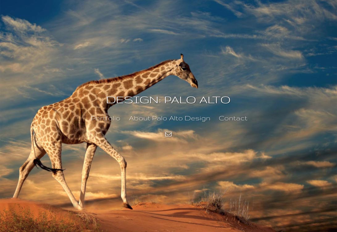
 Featuring a horizontally-scrolling carousel gallery display, Palo Alto is dynamic, modern and easy to view with a large image display that displays captions and selling information. Featuring a horizontally-scrolling carousel gallery display, Palo Alto is dynamic, modern and easy to view with a large image display that displays captions and selling information.For this design example, we've uploaded a series of large (2560 x1400 pixel) images for the home page - one of the images comes up randomly each time you reach the home page. This kind of entry page can be done for any of our layouts. With Palo Alto, you can choose your top navigation and logo style. For this example, we used the centered display, but your logo can also display on either the left or right side. 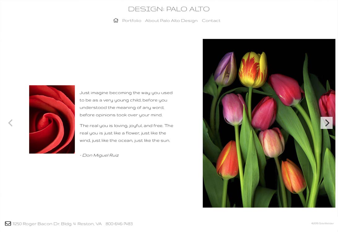 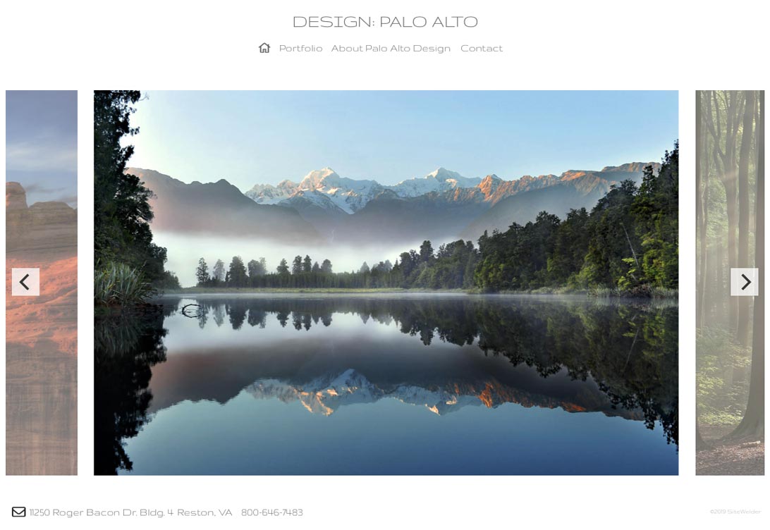 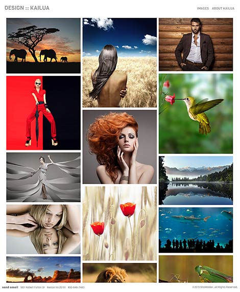 With a cascading flow of thumbnail images, Kailua is a dynamic and fully responsive HTML5 design which is optimized for all displays, from large cinema displays to small mobile devices.
Kailua features a unique set of options for your home page: with thumbnail display, you can choose either a random display of all of your active gallery images or a specific set of images you want to display as part of a home page image gallery. Alternatively, you can display your images as large images set into a flowing slide show. Clicking on thumbnail images brings up large scalable detail images, with easy-to-read captions and optional purchase information buttons. On mobile displays like iPads and iPhones, Kailua displays in an optimized format with a mobile navigational menu and pulldown display. The images display in optimized formats in unique ways on portrait and landscape views on mobile devices as well. 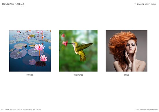 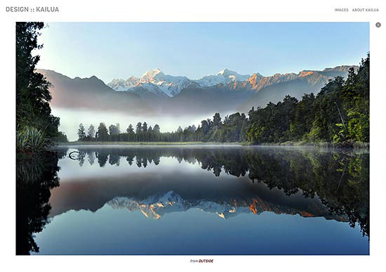 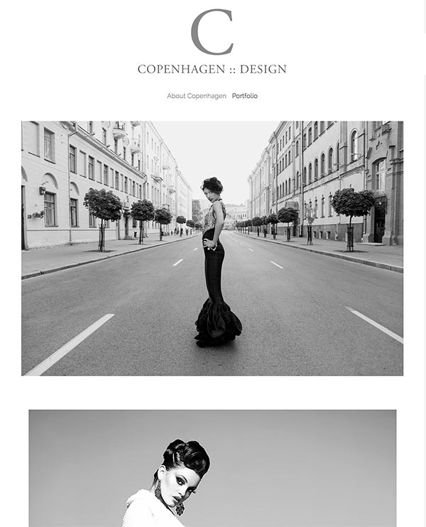 Copenhagen is a dynamic HTML 5 design which features vertical scrolling through dynamically-sized images.
Many users prefer quickly scrolling through images in a vertical display. In our example here, we've uploaded the images at 1920 by 1200 pixels. With image scaling, though, the homepage and gallery images look great on all monitor sizes, even small laptops. On smaller monitors or with browsers set to a narrow width, the images automatically scale down to fit the width of the display. Captions and optional shopping cart buttons display below images. Arrows display on the top and bottom of each image on mouse rollovers to direct the user up and down the page. With a built-in search engine, Copenhagen also allows for quick searches on image captions and gallery names. 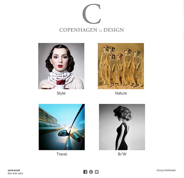 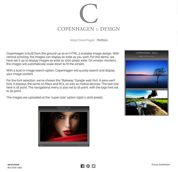 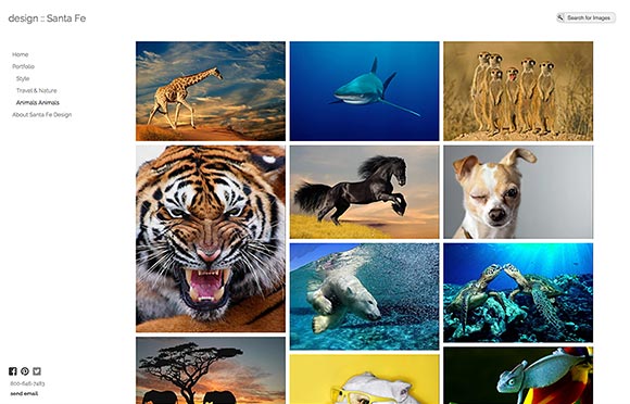 Designed from the ground up as an HTML 5 design, Santa Fe features dynamic thumbnail display and full-screen images.
With a built-in search capability, users can easily search through your images. Images and thumbnails will automatically scale to fit your browser display, with easy navigation and an intuitive interface. 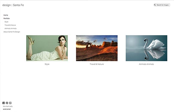 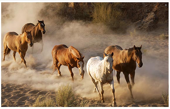
Barcelona features clean horizontal design with top-based navigation and wide-open space for image display and informational page display.
With built-in purchase options, images can include purchase information buttons for inquiries, direct sales or printing options through FotoMoto and Bay Photo. 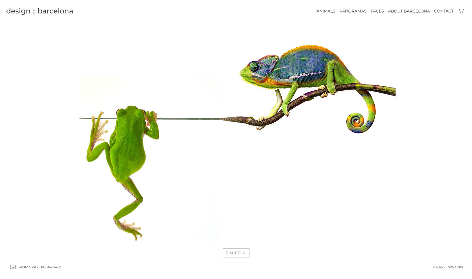 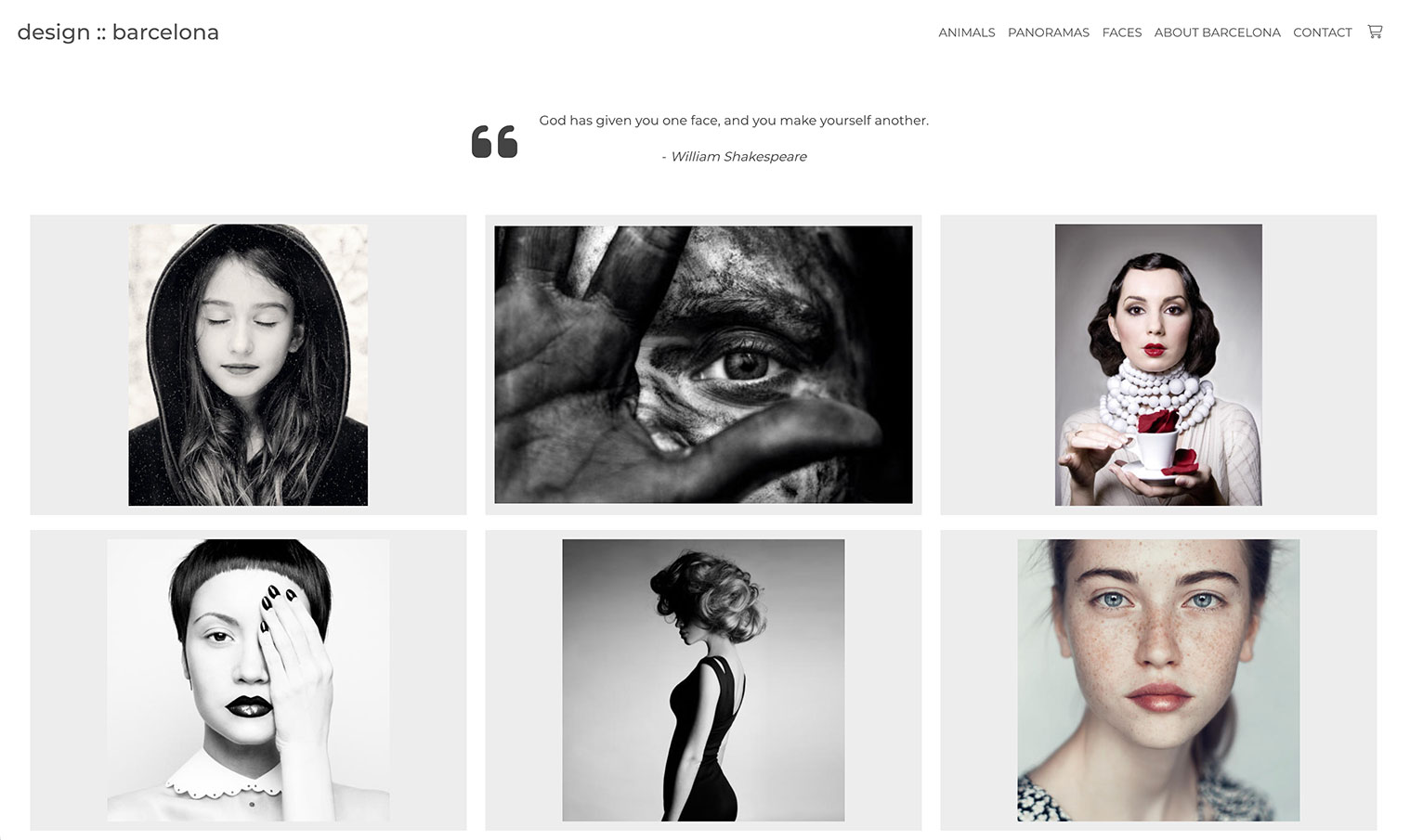 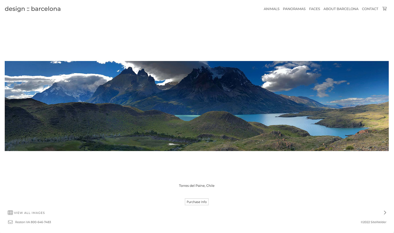 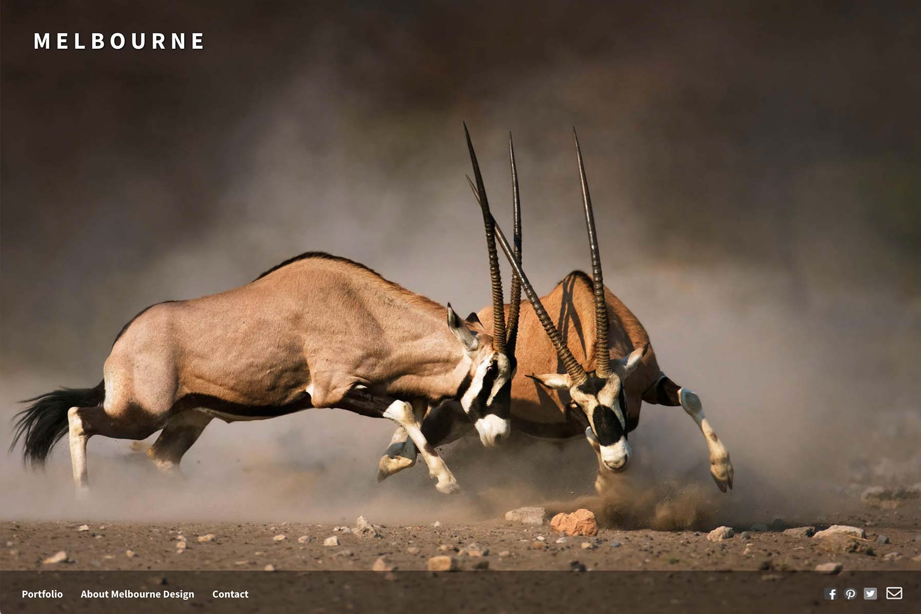 Melbourne is a dynamic HTML 5 compliant design which features amazing options for displaying scalable images.
With Melbourne's dynamic image display, your images will automatically scale down or scale up on different monitor sizes. In our example here, we've uploaded the images at a full 2560 by 1440 pixels - that's the size of a 27" monitor! With image scaling, though, the homepage and gallery images look great on all monitor sizes, even small laptops. As with all of SiteWelder's designs, audio can be included on the home page and inside galleries. Melbourne also looks great on mobile devices. 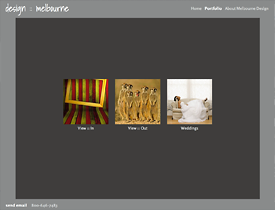 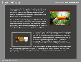  With its built-in image scaling, Prague can be a great choice for displaying your images large on big monitors while scaling down the images to fit a smaller laptop monitor.
For this design example, we've uploaded a series of large (1920 x 1200 pixel) images for the home page - one of the images comes up randomly each time you reach the home page. This kind of entry page can be done for any of our layouts. You can use site-wide audio with Prague as well - the music will start playing after entering the site from the home entry page. 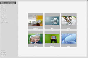 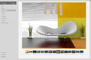  Featuring left-side navigation and right-side thumbnails, Montreal is great for easy navigation and clear image display. With a large space available for image display, Montreal can be a very effective way to display large vertical images (portrait photographers, this could be helpful for you).
One of our designs which feature dynamic image-scaling, your images will fit nicely on all monitors from laptops to cinema displays. 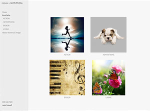 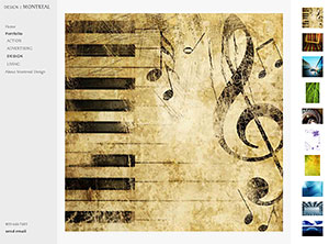 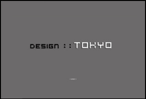 Tokyo is for people who want something different from their web site design. Featuring a curving top band and split navigation on the top and left for informational and gallery pages, Tokyo is stylish and fun.
Images in HTML galleries display with dynamic image sizing with thumbnails towards the top of the pages. Flash slideshows display with scalable image-sizing as well. 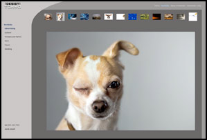 
|